Wednesday, 31 March 2010

Film magazine Ideas


For our own magazine cover featuring our film, I decided that I wasn't going to recreate a magazine that already exsisted, so I came up with an original one, I named it Raw.Film, becasue the music magazine that I created during the As project was called Raw.Music, so I thought it worked for both.
To create the magazine I combined my use of Adobe Photoshop and Macromedia Freehand. I used an image of the characters, which I edited the background in photoshop and saved in tiff. format.


I then put it into Macromedia Freehand and worked on the fonts and text to go with the imagery. I exported it as a Jpeg. file:

As this was just an initial idea, I was not overally thrilled about it, as it is very simple, plain and quite dull.
It doesn't grab the attention or jump out at the reader.
When I looked back and the covers of the real magazines I decided that I would do a second magazine cover to make it look more like a magazine.
I went back into adobe and used the park image that I used for the park, but instead of the characters back to back, Tessa suggested that I over lay an image of the white coated girl ontop of the red coat girl, and make the opacity so that the red coat comes through the white.
I used an image of the white girl with her hood up and her back to the camera, and an image of the red coat girl facing the camera.


I used the same technique for cutting and changing the opacity, and I used a font from the generic fonts, called Magneto.
I then flattened the image and converted it to Tiff. Then I imported the image into Macromedia Freehand and worked on the rest of the text there. I decided to go with a white and gold/yellow for the accents, as these went with the black and white background.
I went back to adobe to crop down another smaller image to include on the cover, and to crop down an image of a barcode.

Once I had finished it I exported it to a Jpeg. File:


I prefer this one so much more to my original ideas, because I think it looks so much more like a movie magazine now and I prefer the image and the colours I have chosen as they work much better together, and I think it is much more eye-catching.

Movie Magazines: Empire

Empire is a British film magazine published monthly by Bauer Consumer Media. From the first issue in July 1989, the magazine was edited by Barry McIlheney and published by Emap. Bauer purchased Emap Consumer Media in early 2008. It is the biggest selling film magazine in Britain, consistently outselling its nearest market rival Total Film and is also published in Australia, Turkey and Russia. Empire organises the annual Empire Awards which were sponsored by Sony Ericsson until 2009 and are now sponsored by Jameson.

Editor: Mark Dinning
First issue: July 1989

Company: Bauer

This cover again contains all the conventions, and is much more crowded than Total Film magazine.
The use of different fonts adds some depth to the cover, and some diversity, giving the eye somethign to grab hold of.
The image of the joker is a very well known and striking image, and they have chosen the colours to go with it really well.
I really like this cover because it really stands out, and the text works really well with the imagery.


This cover is different to the first one with the way they have arranged the text on the cover. There is also alot of smaller imagery, which can also attract the eye of the reader.
Again they have chosen the colours really well to work with the set of images.
I don't like this cover as much as I liked the previous one because I think there is something a bit dull about it, it is probably the fact that the main text is in a grey colour which doesn't really grab the attention, although it works well, I prefer the first cover I looked at.


This one is really simple, I like the text going straight across the middle of the cover, I think it is really effective, but the colours used are really dull, and not very eye-catching. This one is really plain and it looks scarce and not as crowded or exciting as the others. Out of all of them I dislike this one the least. I think the change of font works as a way of breaking things up but even the image is a dark photo so over all I don't think it is very exciting.

Movie Magazines: Total Film

Total Film, published by Future Publishing, is the United Kingdom's second best-selling film magazine. It offers film and DVD news, reviews, and features. The magazine was launched in 1997 and is published every four weeks (13 times a year).

Circulation: 85,031 (2008 average)
First issue: 1997
Company: Future Publishing

To get some ideas for my magazine cover I looked at some of the covers for Total Film magazine,
 
This cover includes everything that a magazine cover should, it has the title, and the price and the barcode. It has a main feature, which the image on the cover is rellavent to, and it tells the reader what other features are included on the magazine.
The layout for this issue, is quite simple there is not alot of text on it as the image takes up alot of the space, but I think it really works.


This one is a similar layout, but there is a little bit more text because the image does not take up as much space. Also becuase it is the same magazine it will be a similar layout, as magazine's usualy follow a layout for each issue, making it recognisable and the reader is familiar with it when they read it.
This cover is much more striking than the one before but this is because the image is in colour and I think it is much more eye-catching than a black and white image.


For this one they have changed the layout slightly, the characters are infront of the title, instead of behind, but this is because of the image, and the title would have covered the faces of the characters.
It's also different becuase of the positioning of the text, where as before there was centered main text, on this one all the main text is aligned to the left.
There are smaller images on the cover, making it look a little crowded but not as simply laid out like the others.
I like this layout because I think along with the smaller images there is more to grab the attention of a reader.

Film Magazines

Film magazines are published by companies and institutions like Futuer publishing who publish Total Film magazine, and Bauer Consumer Media, who produce british film magazine Empire.
Film magazines usualy feature reviews, latest releases, interviews and competitions etc. The covers usualy show a film, or a star wich is the main feature in the magazine, with the magazine title, and information about other features of the magazine.
They target people who love film, and want to know the exclusives and what is coming up in the box office.

Option One

We chose option one as the film poster, so I researched into who produces the posters and for who. Where you can find the posters, and I looked at some exsisting posters.
I then created some intial ideas for the poster, which I am going to show the class along with the trailer and get some feedback on them, on how relevant they are to eachother etc.
Next I am going to look at our second option, the film magazine.

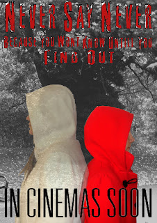
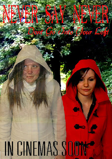
Poster Idea 2

For the second idea of the poster, I used the same background image, but different images of the girls,


I also used new fonts, becasue we changed it on the trailer, so I used that one to match, we also came up with a new tag line for the film.


I used the same techniques as I did for the first poster idea, but this time I made the background image black and white, to make the two characters more bright and noticeable.


I prefer this poster, although the tag line is hard to read in this font. We are taking both the poster and the trailer for intial feedback from the rest of our Media class.

Poster Idea

For the poster, I decided I wanted it to feature the two girls from the trailer, in their red and white coats. I want to put them on a background of the park, becuase alot of the trailer/ film takes place in this location, so I also took a few pictures of this.


I then found some fonts that I wanted to use on the poster, the same as I used in the trailer, on the website http://www.dafont.com/ .

After this, I put it all into Adobe Photoshop to mess around, and see what I could do with it, and try and get my ideas out onto the page.
What I did was to crop a small part of the park photo out onto a blank A4 page, and change the contrast and balance so that it was quite dark. I then used the magentic lasso tool to take the red coated girl and layer her ontop of the park scene, again changing the contrast.
With the white coated girl I used the same tool, and layered her into the picture as well, I changed her opacity, to make her look ghostly.
I then used the wand tool, to layer the text over, changing the colour to make it look more attractive, and to show up more.
This was the out come:
I think that this poster is quite simple, and it is missing some key elements. I think I will keep the concept of the two girls but do it slightly differently, becasue I think the background takes over too much so I need to tone that down, and I also need to make the font clearer, and the white coated girl more ghostly.

Exsisting Film Posters

To get some ideas for our own poster ideas, I looked at some posters for films that already exsist.

Th first one I looked at was the Twighlight Saga: New Moon teaser poster:

This poster contains the three main characters of the film, the title, and the date, it has practically no film listings. This is a teaser poster, so it is not meant to give much away about the film.
I think this poster works, because the people who this poster is going to target, will recognise the characters and that will grab their attention. These three characters are the Unique Selling Point of this poster.


This is the second poster I looked at, it is the teaser poster for the Batman film The Dark Knight. Again this does not give much away about the film, it does not contain any characters, but the graphic is what will catch people eyes. The Batman symbol will grab the attention of Batman fans and teenage boys (because most boys know the batman symbol), which is who the main audience is for this film.
It only gives away the year the film will be released, not a specific date, keeping mystery about the film. Again it has practically no listings on the poster, but it includes the title at the bottom and a tag line at the top.


This is the poster for the film IronMan, it is the main poster so it has more details on it. It has more film listings at the bottom, and at the top gives you the actors names. It shows images of the characters, the main character being the biggest, and then smaller counter parts have smaller pictures. These are the characters with the biggest parts, and the actors with the biggest names, which are going to sell the film, the Unique Selling Points.
I like the layout of this poster although it is a simple layout it really works to grab the attention of the attended audience.


This is for the film Cloverfield. For this poster they have chosen to use an image of a destroyed Statue of Liberty, this will grab peoples attention because it is a very well known monument.
Along with the tagline 'Some Thing Has Found Us' it will make people want to see the film because people will want to know what has found 'us', using the word us makes it personal which again will make people want to know.
The rest of the poster is really unnoticeable because audiences will focus their attention on the Statue of Liberty, but they have included the title, date and film listings at the bottom.


The poster for The Descent has very little imagery, only the face at the bottom, which is a really striking image, the shaft of light making it look like she is trapped somewhere.
The poster has the title, and a tag line and film listings.
I think this poster is effective because it will catch peoples eye, wanting to know where she is, and 'the descent into what?' it doesnt give very much away, becasue I can't even see a date on the poster. The colour they have used is very effective as well, becasue it makes the girl look very creepy and almost ghost like.


After looking at these posters I have a more clearer idea for what I want to do on my own posters.

Where We See Posters

Film posters are displayed inside and on the outside of movie theaters, and elsewhere on the street or in shops. The same images would appear in a film exhibitor's pressbook and may also be used on websites, DVD-packaging, flyers, advertisements in newspapers and magazines, etc.


The Movie Poster

A film poster is a poster used to advertise a film. There may be several versions for one film, with variations in regards to size, content and country of production of the poster. It usually contains an image with text, though this has evolved over time from image-free bill posters through to the highly visual digital productions of today. The text usually contains the film title in large lettering and often the names of the main actors. It may also include a tag line, the name of the director, names of characters, the release date, etc.
Use of such posters goes back to the earliest public exhibitions of film, where they began as outside placards listing the programme of (short) films to be shown inside the hall or movie theater. By the early 1900s, they began to feature illustrations of a scene from each individual film or an array of overlaid images from several scenes. Other movie posters have used artistic interpretations of a scene or even the theme of the film, represented in a wide variety of artistic styles. Movie posters are produced in a large number of sizes to meet various advertising needs.
Originally, film posters were produced for the exclusive use by the theatres exhibiting the film the poster was created for, and the copies of the posters were required to be returned to the distributor after the film left the theatre. In the United States, posters were usually returned to a nation-wide operation called the National Screen Service (NSS) which printed and distributed most of the film posters for the studios between 1940 and 1984. As an economy measure, the NSS regularly recycled posters that were returned, sending them back out to be used again at another theatre. During this time, a film could stay in circulation for several years, and so many old film posters were badly worn before being retired into storage at an NSS warehouse (most often, they were thrown away when they were no longer needed or had become too worn to be used again). Those posters which were not returned were often thrown away by the theatre owner, but some film posters found their way into the hands of collectors.
Beginning in the 1980s, the American film studios began taking over direct production and distribution of their posters from the National Screen Service and the process of making and distributing film posters became decentralised in that country.


Teaser poster
A teaser poster or advance poster is an early promotional film poster, containing a basic image or design without revealing too much information such as the plot, theme, and characters. The purpose is to incite awareness and generate hype for the film. A tagline may be included. There are some instances when teaser posters are issued long in advance before the film goes into production, although they are issued during the film development.

Most film posters are made for the target market, to catch a certain age groups eye etc. If they are films made for older audiences, 15, 18's etc, the poster is does not usualy contain anything that will not be suitable to be seen in the street or a magazine.
Posters contain:
- Film title
- Sometimes the tag line
- Some movie posters have more film listings than others (depending on whether it is a teaser poster or full poster)
- They include image, photo or grapch which represents or symbolises the film, sometimes using the characters.

Links

Throughout the blog, I have linked mine to the other two people in my group.
When I mention them in the blog, I have turned their names into a link, which when you click on it takes you to their page, this is to make it easier to see what we have done together and what each of us has done.
Each of the links are in Blue, like this:
Aaron  Tessa

Research and Planning Two

In research and planning two, we created our production company name and logo. We came up with the name ALT because it used all our our initials and also the key on a computer keyboard. Aaron came up with the final idea for our logo.
We brainstormed some ideas for the synopsis of the film, coming up with the idea that a young girl, whose mum has just re-married, and she gets posssed by the Step-Dad's previous daughter, who was murdered in the loft, and the young girl now is trying to figure it all out.
We then looked on the website for the BBFC,
http://www.bbfc.co.uk/downloads/pub/Guidelines/BBFC%20Classification%20Guidelines%202009.pdf
to check what the classification guidelines were before we decided one for ours, we then decided on a 15 rating, because of what the content would be, if it was a film.
Tessa created our film pitch in a powerpoint presentation, and then converted it into video format. She used parts of the synopsis we had written along with pictures to explain what was happening.
Then I looked at what made a film trailer/ teaser trailer, the conventions, what it needed to contain, and the length etc.
I then looked at some different types of teaser trailers, just to get an idea of what they did and to gain some inspiration for our own trailer. The two that stood out for me, was the trailer for The Ring, and the trailer for Panic Room, they are both really different but I really liked  the ideas, and what they had done in the trailer.
I then drew up the story boards, for the ideas we had come up with, I did this on big card, and then I took photos of them, and edited them so they were darker, and added text onto them.
Tessa, Aaron and me then came up with a list of props, settings and cast before we could beging filming, we then set up some dates for filming, and created a production schedule, which some points did get delayed due to personal comitments but the filming went well.
We then got a post-production schedule ready, and had trouble getting our footage onto the computer but managed to sort that out, as all we needed was a FireWire cable, and once we had that the editing went all to plan.
The next thing we are going to do is look at exsiting posters and come up with some ideas of our own.

Monday, 29 March 2010

Post Production


 I made the title shots using fonts, which I found on a website called www.dafont.com 

I then used them on Adobe Photoshop to make the title scenes. I also print screened an image of the ‘the following preview’ shot from a video off of YouTube.
Our schedule for editing was delayed quite a bit because we had trouble transferring our data from the camera to the computer. We found out that we needed a FireWire cable, and that there was not one in the school. We went around the school trying to find one, but no-one had or could find one.


We did borrow one off of a friend, so we started editing around the 9th of March. It didn’t go too bad; there were of course a few snags here and there, where clips would jump about, trouble cutting them down and not being able to figure out how to speed the clip up without making it shorter, in the end we left it in the original speed.

We also changed the font we used because we thought the original one was unclear so we used another one which we believed was much clearer.


The other part of the editing that was difficult was trying to get the eyes go red, it was hard to try and re layer the edited image over the actual footage, and time it right.
Once I had got hold of the sound clips, which Aaron downloaded and he found a really creepy score of music, called Blood Theme, by Daniel Licht, I cut the song down in a software called Audacity, and made one section quieter, so that when the footage begins the song becomes background noise. The three of us also recorded our own voices saying ‘Go into the Loft’ in different pitches, and I layered them over each other so that it sounded ghostly.


Once I had finished the editing, I exported it in each different format to see which one was the clearest.

Production Schedule and Production Blog

We took out the parts on our storyboard establishing the house at the beginning with the car driving in, because due to a helper’s commitments we were unable to film these parts. We also removed the scene where the newspapers are falling, because we were not sure how able we were to pull that shot off, as we needed to mock up newspapers and then get them to fall the way we wanted them too.

Tessa was our camera-man and me and Aaron directed where and what we wanted each shot to be.
The filming in the park went very well and to schedule, although it was a rainy day, but we all agreed that it worked with the rain, making the setting look more dreary and dull. We changed some of the shots slightly, due to the realities of the location, but they are not major alterations.
We had to change the date we filmed the other parts, because again of timing and commitment difficulties within the group.
We couldn’t film the close up of the eyes until 10th March, we did this in school and had to film it a couple of times to get the right look , and because we needed it central so that we could edit the eyes to make them red.
We were not able to film the loft scenes together, so Tessa filmed them on her own using her own loft and ladder. She said that it went very well, and I think that the handheld motion of these parts work really well for the trailer, making it seem as if we are taking it from the direct point of view from the character.

Overall I am pleased to say that apart from a few glitches that our filming production went well.

Props, Setting and Cast Lists

This is our props, setting and cast list:

Settings:
- Scary looking house
- Park, trees

- Back garden/ garden shed
Props:
- Ladder
- Newspaper clippings, family photos
- clothing, casual, normal, nothing fancy, old clothes as they will become dirty
- Torches
Sound:
- Dog barking
- Heavy panic panting
- Crackling
Cast:
- Main Girl: Hannah Hand
- Ghost Girl: Tessa Hambleton
- Villain: Zack Warner

Storyboard

Before we can film anything for our teaser trailer we came up with some ideas for the shots we want to use. I drew out our story boards on A3 card, numbering each shot so that it made it easier when we came to film, and create our schedule. I then took photos of the story boards, I also edited them in Adobe Photoshop to make the pencil darker and to add in the text:


Film/Teaser Trailers Viewed

As apart of our research we were sent to look up different film and teaser trailers to get an idea of what they do, their purpose and to gain some ideas of what we can do in our own trailer.
At first we just watched general teaser trailers, that were not for our specific genre, this was just to get an idea of what the conventions were, for example, no longer than two minutes, doesnt give much away, usualy short quick clips.
The first one I looked at was the teaser trailer for Disney Pixa's Toy Story 3:
http://www.youtube.com/watch?v=5f-MYl-HzNw

This trailer doesn't show any actual footage from the film so it is a complete mystery, and doesn't give any clue as to what might happen in the film. It's only 1minute 43seconds long, and really only gives you who made it, the title of it and when it will be released.

The second trailer I watched was for Disney's The Princess and The Frog:
http://www.youtube.com/watch?v=Rjtdl1a_Jqc

Its just over a minute long, and shows the princess reluctant to kiss the frog, so in effect we do not gain much about the film from this trailer. I think it works as a teaser trailer because its so short and it doesn't give alot away.

I then went on to watch the Twilight teaser trailer, because I thought it would give me a better perspective of a film trailer than the animated films.

This really works as a teaser trailer because the clips are really quick and short, the whole thing is only 59 seconds long and it doesn't give away the whole film. If people did not know what the books of this film where about then all you would gain from this trailer is that it is a story of dangerous romance.
I then went on to look at horror movie teaser trailers, to get some ideas for our project.
I watched the teaser trailer for the film Cloverfield, becasue I remeber watching it in the cinema and I remember thinking 'what is actually going on'
http://www.youtube.com/watch?v=IvNkGm8mxiM

All we can gain from this trailer is that something has attacked New York city, this trailer is a bit longer than the others at 1minute 50seconds, but it still doesn't give much away.

I then went on to watch the teaser trailer for The Ring:
http://www.youtube.com/watch?v=aHa7dcCntyI

I really liked the way the trailer was put together on this one, it is 1minute 33seconds, and even though it tells you about the underline of the film, the clips in the trailer do not really merge together. They are all mixed up together and I think it is really effective to the trailer. There is not alot of sound on the trailer, and what there is, is quite quiet, and I think this adds to the overall effect.

The last teaser trailer I looked at for horror movies, was the trailer for Panic Room:


This trailer really works, becuase I think, it is the lack of sound, at the beginning there is dialouge and then there is only music over the clips. Not being able to hear what is going on in the footage adds a bit of mystery to the trailer, because it disorientates the audience as to what is really going on. At the end it doesn't even give away when the film is coming out, it just says 'Panic Room', so it is really secretive. Over all I think this is a really effective trailer.

Thursday, 25 March 2010

The Film Trailer/ Teaser Trailer

Film trailers are between 2-3 minutes long. They have about 100 cuts in them. They are designed to make the audience feel both:
- The pleasure of the text, the audience recognises familiar conventions and narratives.

- Suspense in the audience, by the use of Enigma codes. Who is the killer? What happens next?

The film trailer itself tends to be structured in the following way; this structure is not ‘set in stone’ and can be moved around to have a greater effect:
- The distributor company logo
- The production company logo
- The narrative establisher, a series of longer sequences which establish the fundamental storylines of the film.
- The stars or the USP (the unique selling point) often stars or directors. Horror movies traditionally don’t always use well-known stars because the audience feel more uncomfortable with actors they don’t recognise and they don’t make them feel secure. In the trailer for the horror movie Scream, the director Wes Craven is the USP because he famous for directing the cult horror movie Nightmare on Elm Street.
- A series of quick, exciting, suspenseful sequences from the film, this is the convincer in that is should create enough suspense to ensure that the audience decide to go and watch the film.
- The conventions of the genre will appear all through the trailer.
- The black and white film listings
A teaser trailer is a lot shorter, under 2minutes of footage. It is created for effect and not to give too much away about the film, it keeps the audience intrigued, they use lots of cuts and not always cuts that are used in the film, these cuts would be specially filmed for the trailer. The USP is featured in the trailer to create a even more of a intrigue and get the audience interested.

The Film Pitch

Tessa made our film pitch in a Microsoft PowerPoint presentation and then transfered it into AdobePremier Elements to make a video out of it.
There was a technical difficulty once she had exported it and the music we used to accompany the video cuts out near the end of the presentation.

Classification Choice

Source:
http://www.bbfc.co.uk/downloads/pub/Guidelines/BBFC%20Classification%20Guidelines%202009.pdf


U Universal –
Suitable for all
It is impossible to predict what might upset any particular child. But a ‘U’ film should be suitable for audiences aged four years and over. ‘U’ films should be set within a positive moral framework and should offer reassuring counterbalances to any violence, threat or horror.


If a work is particularly suitable for a pre-school child to view alone, this will be indicated in the Consumer Advice.


PG
Parental Guidance –
General viewing, but some scenes may be unsuitable for young children. Unaccompanied children of any age may watch. A ‘PG’ film should not disturb a child aged around eight or older. However, parents are advised to consider whether the content may upset younger or more sensitive children.


12A/12 –
Suitable for 12 years and over
Exactly the same criteria are used to classify works at ‘12A’ and ‘12’. These categories are awarded where the material is suitable, in general, only for those aged 12 and over. Works classified at these categories may upset children under 12 or contain material which many parents will find unsuitable for them. The ‘12A’ category exists only for cinema films. No one younger than 12 may see a ‘12A’ film in a cinema unless accompanied by an adult and films classified
‘12A’ are not recommended for a child below 12. An adult may take a younger child if, in their judgement, the film is suitable for that particular child. In such circumstances, responsibility for allowing a child under 12 to view lies with the accompanying adult.
The ‘12’ category exists only for video works. No one younger than 12 may rent or buy a ‘12’ rated video work.


15 –
Suitable only for 15 years and over
No one younger than 15 may see a ‘15’ film in a cinema. No one younger than 15 may rent or buy a ‘15’ rated video work.


18-
Suitable only for adults
No-one younger than 18 may see an ‘18’ film in a cinema. No-one younger than 18 may rent or buy an ‘18’ rated video.


Classification for our film:
The classification we have chosen for our film is a 15, because after we read the guidelines, we decided that the plot isn’t scary enough, and because the sexualised storyline of rape and abuse is only implied and not shown.
There will be no nudity and the violence is not a big part of the story line. There is also tame language; no drugs or discrimination, there is not any glamorisation of weapons and the behaviour of the film is not that which would be copied or encouraged.