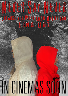
For the second idea of the poster, I used the same background image, but different images of the girls,
I also used new fonts, becasue we changed it on the trailer, so I used that one to match, we also came up with a new tag line for the film.
I used the same techniques as I did for the first poster idea, but this time I made the background image black and white, to make the two characters more bright and noticeable.
I prefer this poster, although the tag line is hard to read in this font. We are taking both the poster and the trailer for intial feedback from the rest of our Media class.


No comments:
Post a Comment