I then found some fonts that I wanted to use on the poster, the same as I used in the trailer, on the website http://www.dafont.com/ .
After this, I put it all into Adobe Photoshop to mess around, and see what I could do with it, and try and get my ideas out onto the page.
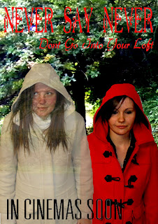
What I did was to crop a small part of the park photo out onto a blank A4 page, and change the contrast and balance so that it was quite dark. I then used the magentic lasso tool to take the red coated girl and layer her ontop of the park scene, again changing the contrast.
With the white coated girl I used the same tool, and layered her into the picture as well, I changed her opacity, to make her look ghostly.
I then used the wand tool, to layer the text over, changing the colour to make it look more attractive, and to show up more.
This was the out come:
I think that this poster is quite simple, and it is missing some key elements. I think I will keep the concept of the two girls but do it slightly differently, becasue I think the background takes over too much so I need to tone that down, and I also need to make the font clearer, and the white coated girl more ghostly.


No comments:
Post a Comment